

 rysasahrial
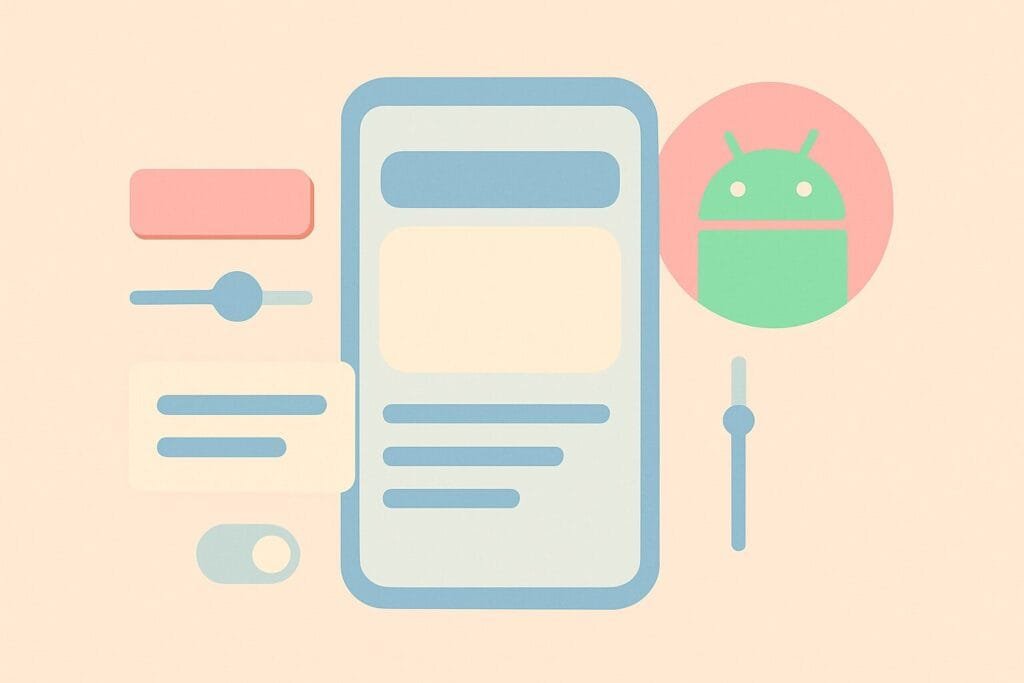
Material Design Components (MDC) have revolutionized the way developers design Android applications by providing a comprehensive set of UI elements that follow Google’s design guidelines. By using these components, developers can create consistent, intuitive, and visually appealing interfaces that enhance the user experience across different Android versions and screen sizes.
What is Material Design?
Material Design is a design language developed by Google that aims to combine classic principles of good design with the innovation and possibility of technology and science. Introduced in 2014, it focuses on grid-based layouts, responsive animations and transitions, padding, and depth effects such as lighting and shadows.
Material Design Components bring this philosophy to life in Android development by providing ready-to-use UI widgets like Buttons, Cards, Chips, Dialogs, Navigation Drawers, App Bars, and more.
Key Benefits of Using Material Components
- Consistency Across Apps: Using MDC ensures your app aligns with the look and feel of other modern Android apps, enhancing familiarity for users.
- Responsiveness: Components are designed to adapt to multiple screen sizes and configurations.
- Accessibility: Built-in support for accessibility tools makes your app more inclusive.
- Frequent Updates: Maintained by Google, MDCs are regularly updated with bug fixes and new features.
How to Add Material Components to Your Project
To start using MDC in your Android project, add the following dependency in your build.gradle file:
dependencies {
    implementation 'com.google.android.material:material:1.12.0'
}
You should also set your Theme to a Material Components theme in styles.xml:
<style name="AppTheme" parent="Theme.Material3.DayNight.DarkActionBar">
    <!-- Customize your theme here -->
</style>
Commonly Used Material Components
- AppBar (TopAppBar)
A customizable top app bar that can contain title, navigation icon, and actions. - BottomNavigationView
A navigation bar at the bottom that allows users to switch between top-level views. - FloatingActionButton (FAB)
A circular button that triggers the primary action in an app. - MaterialButton
An enhanced button that supports icons, elevation, ripple effects, and more. - TextInputLayout and TextInputEditText
These components provide animated hints, error messages, and input validation. - CardView
Displays content in a card format with elevation and corner radius styling. - Chip
Used for filtering content or for entering data, chips are interactive and can include icons.
Styling with Material Theming
Material Theming allows you to customize Material Components by defining your own color, typography, and shape systems. This is done in the themes.xml and colors resource files.
For example, to change the primary color:
<item name="colorPrimary">@color/my_primary</item>
<item name="colorPrimaryVariant">@color/my_primary_dark</item>
<item name="colorOnPrimary">@color/white</item>
You can also explore the Material Theme Builder tool to experiment visually with colors and export theme files for Android apps. Try it here:
Material Theme Builder
Material You (Material 3)
The latest update to Material Design is “Material You” or Material 3, introduced with Android 12. It includes dynamic color theming that adapts to the user’s wallpaper and provides more expressive UI components. Developers are encouraged to migrate to Material 3 for the most modern experience.
Conclusion
Using Material Design Components in Android development not only improves the visual quality of your application but also ensures usability, accessibility, and performance. By adhering to these design standards, your app will not only look professional but will also deliver a cohesive experience to users.
Whether you’re building a new app or revamping an old one, integrating MDC should be a priority. It aligns your UI with the latest trends and offers powerful tools to build beautiful Android applications more efficiently.