

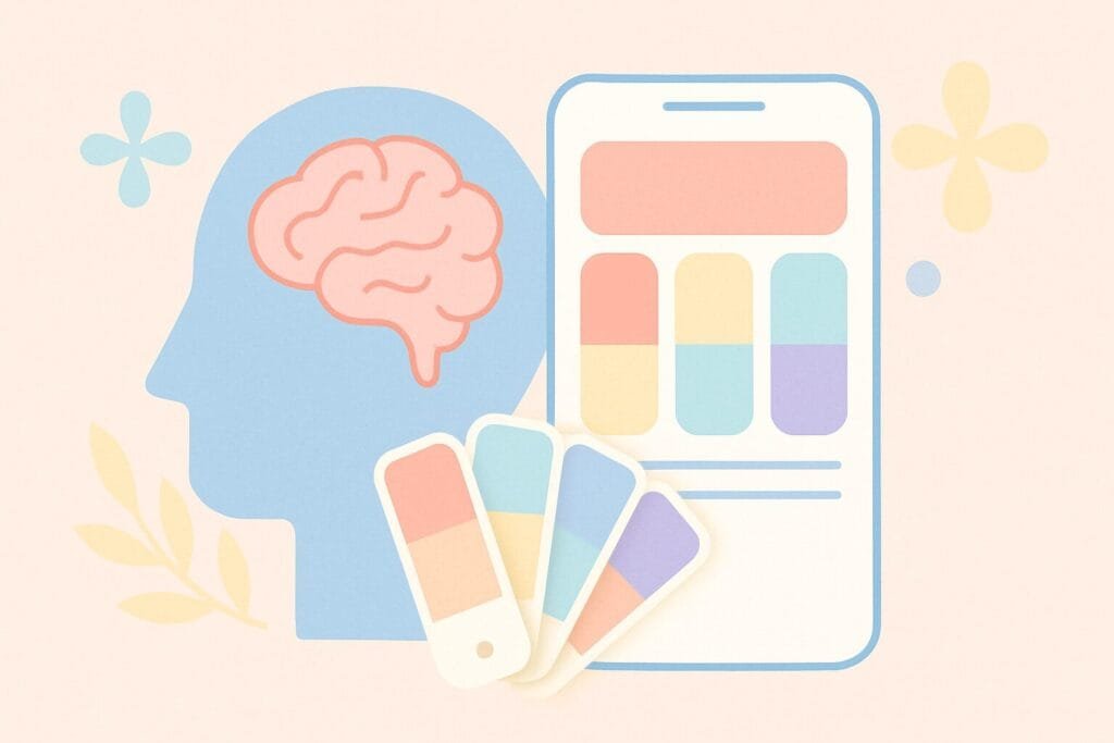
Color is not just a design decision it’s a psychological tool. In mobile app design, the right color palette can influence user behavior, emotion, and perception. From increasing engagement to guiding navigation, understanding the psychology behind mobile color palettes is essential for designers who aim to create intuitive and impactful user experiences.
Why Color Matters in Mobile UX
Color psychology is the study of how colors affect human behavior and mood. Different hues trigger different emotional responses. For example:
- Blue often evokes trust and calmness.
- Red can trigger urgency or excitement.
- Green is associated with growth and balance.
- Yellow reflects energy but can also signal warning.
These reactions are vital in mobile UX where decisions are made in seconds. A color choice can determine whether a user stays or leaves.
Color Preferences by Industry
| Industry | Preferred Colors | Psychological Impact |
|---|---|---|
| Finance | Blue, Grey | Trust, Stability |
| Health/Fitness | Green, White | Clean, Vital, Natural |
| Retail/E-commerce | Red, Orange, Black | Excitement, Confidence, Luxury |
| Education | Blue, Yellow | Reliability, Optimism |
| Social Media | Blue, Purple | Connection, Creativity |
Understanding your app’s niche can help you pick the right emotional tone. For example, a fitness app that uses blue may lack energy, while red or green can invoke vitality and action.
Cultural Considerations in Color Use
Color meaning is not universal. In Western countries, white means purity, but in some Eastern cultures, it symbolizes mourning. Designers should consider their target demographic’s cultural associations to avoid miscommunication.
Accessibility and Contrast
Accessibility is crucial. Poor contrast or excessive brightness can cause user fatigue or alienate color-blind users. Use tools like WebAIM Contrast Checker to ensure legibility and inclusivity.
Emotional Design and Retention
Emotionally intelligent design uses color to:
- Highlight CTAs (e.g., green buttons for “Submit”)
- Reduce cognitive load (soft background tones)
- Reinforce brand identity (consistent color usage)
Apps that evoke the right emotions build stronger user retention and brand loyalty.
Trends in Mobile Color Palettes
Modern mobile design often embraces:
- Neomorphism: Soft shadows and light tones
- Dark mode: Reduces eye strain, conserves battery
- Minimal palettes: Focuses attention, increases clarity
While following trends is tempting, understanding the why behind each choice ensures design decisions remain user-centered.