

 rysasahrial
When building Flutter applications using Dart, interactive form elements such as Radio Buttons and Checkboxes are essential components for user input. These widgets allow users to make single or multiple selections within your app. In this article, you’ll learn how to implement Radio Buttons and Checkboxes using Dart in Android Studio, complete with clean code examples and practical UI layouts.
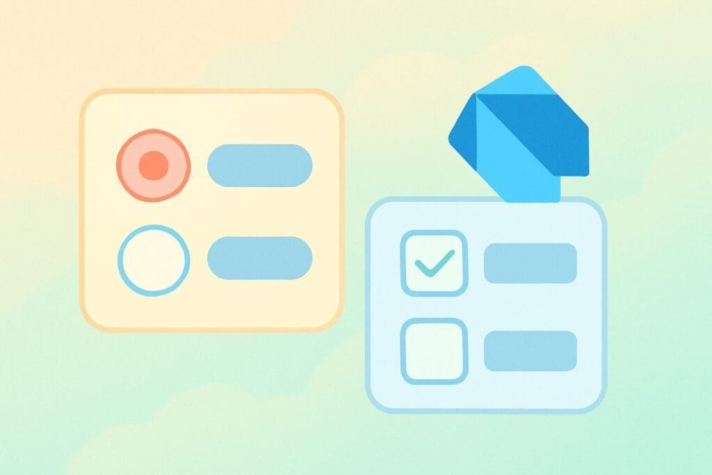
Radio Buttons in Dart (Flutter)
Radio Buttons allow users to select only one option from a group. In Flutter, the Radio widget is used in combination with a common group value and a change handler.
Here’s a full example:
// radio_buttons_example.dart
import 'package:flutter/material.dart';

void main() => runApp(MyApp());

class MyApp extends StatelessWidget {
  @override
  Widget build(BuildContext context) {
    return MaterialApp(
      title: 'Radio Buttons Example',
      home: RadioButtonExample(),
    );
  }
}

class RadioButtonExample extends StatefulWidget {
  @override
  _RadioButtonExampleState createState() => _RadioButtonExampleState();
}

class _RadioButtonExampleState extends State<RadioButtonExample> {
  String? _selectedGender = 'Male';

  @override
  Widget build(BuildContext context) {
    return Scaffold(
      appBar: AppBar(title: Text('Radio Button Example')),
      body: Column(
        children: <Widget>[
          ListTile(
            title: Text('Male'),
            leading: Radio<String>(
              value: 'Male',
              groupValue: _selectedGender,
              onChanged: (value) {
                setState(() {
                  _selectedGender = value;
                });
              },
            ),
          ),
          ListTile(
            title: Text('Female'),
            leading: Radio<String>(
              value: 'Female',
              groupValue: _selectedGender,
              onChanged: (value) {
                setState(() {
                  _selectedGender = value;
                });
              },
            ),
          ),
          Text('Selected Gender: $_selectedGender'),
        ],
      ),
    );
  }
}
Checkboxes in Dart (Flutter)
Unlike radio buttons, checkboxes allow users to select multiple options. Flutter provides a Checkbox widget to achieve this.
Here is a complete example:
// checkboxes_example.dart
import 'package:flutter/material.dart';

void main() => runApp(MyApp());

class MyApp extends StatelessWidget {
  @override
  Widget build(BuildContext context) {
    return MaterialApp(
      title: 'Checkboxes Example',
      home: CheckboxExample(),
    );
  }
}

class CheckboxExample extends StatefulWidget {
  @override
  _CheckboxExampleState createState() => _CheckboxExampleState();
}

class _CheckboxExampleState extends State<CheckboxExample> {
  bool _isAndroidSelected = false;
  bool _isIOSSelected = false;

  @override
  Widget build(BuildContext context) {
    return Scaffold(
      appBar: AppBar(title: Text('Checkbox Example')),
      body: Column(
        children: <Widget>[
          CheckboxListTile(
            title: Text('Android'),
            value: _isAndroidSelected,
            onChanged: (bool? value) {
              setState(() {
                _isAndroidSelected = value ?? false;
              });
            },
          ),
          CheckboxListTile(
            title: Text('iOS'),
            value: _isIOSSelected,
            onChanged: (bool? value) {
              setState(() {
                _isIOSSelected = value ?? false;
              });
            },
          ),
          Text('Selected Platforms: ' +
              (_isAndroidSelected ? 'Android ' : '') +
              (_isIOSSelected ? 'iOS' : '')),
        ],
      ),
    );
  }
}
Why Use Dart and Flutter for UI?
Flutter offers a reactive and fast way to build modern UIs across platforms. Dart as the programming language brings type safety, performance, and developer-friendly syntax. For more in-depth widget documentation, you can visit the Flutter official documentation.